


Red Bull Livery- Good or Bad?
- This topic has 16 replies, 13 voices, and was last updated 13 years, 8 months ago by
beneboy.
- AuthorPosts
- 4th August 2010, 12:54 at 12:54 pm #127932
Ned Flanders
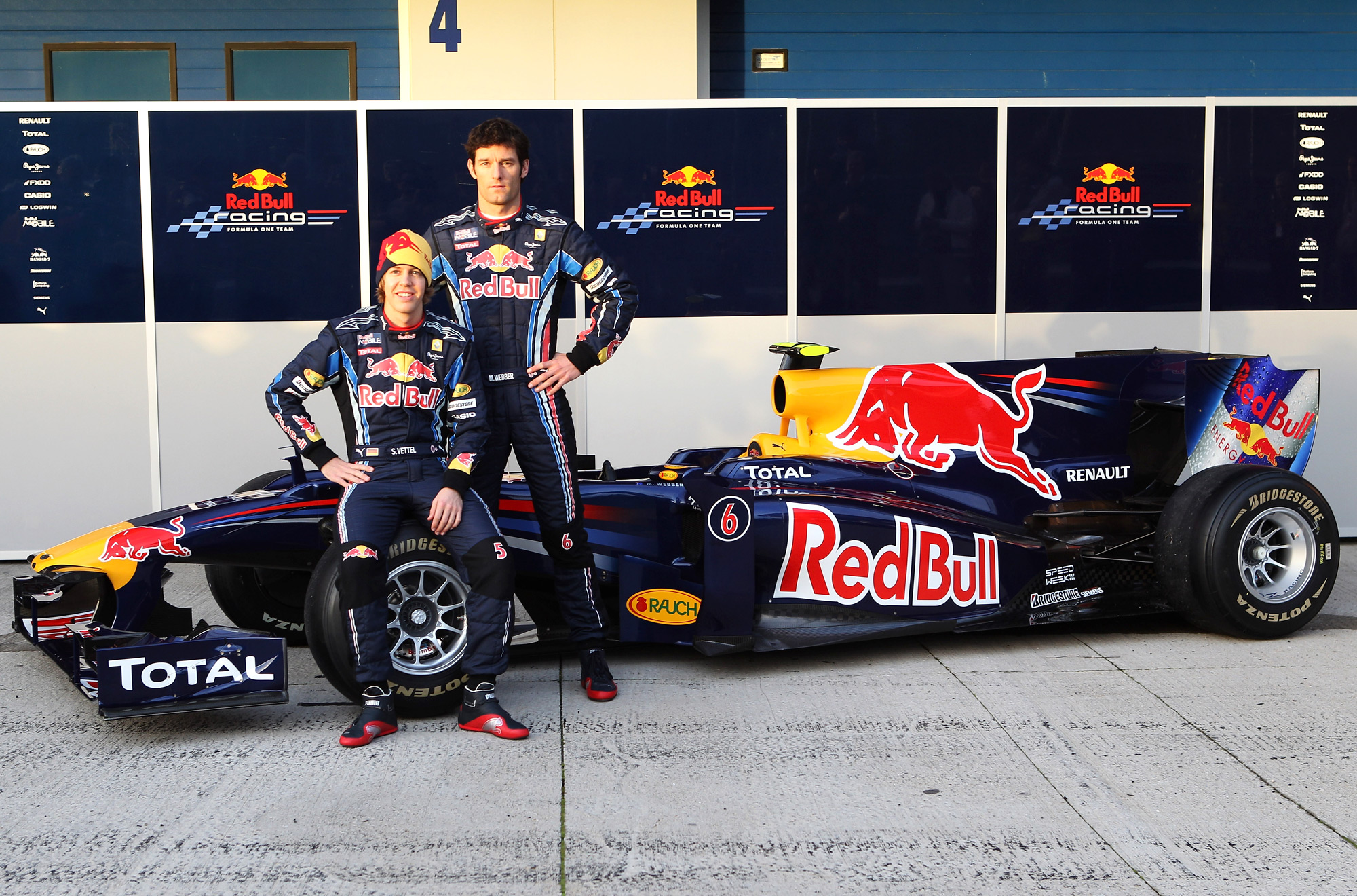
ParticipantSlighty random question, I know, but I was wondering what people’s opinions are on Red Bull Racing’s ever present blue colour scheme. After 6 seasons of running a near identical design, is anyone else hoping for a change?
Personally, I think it’s one of the better liveries on the grid, and I like the bull and sun graphic they use, but I’d like to see a revamp soon as it’s getting a bit tired- Red Bull are fast becoming the Toyota of livery design!
2005- http://upload.wikimedia.org/wikipedia/commons/4/40/Coulthard_RedBull_Canada2005.jpg
2010- http://www.ausmotive.com/F1/2010/RBR-RB6-launch-01.jpg
Also, is it just me or does anyone miss the film tie ins they always used to do at the Monaco GP? Seeing David Coulthard on the podium in a Superman cape was a sight to behold!
4th August 2010, 12:59 at 12:59 pm #143169 TommyBParticipant
Love the new one a lot more it’s brighter and almost purple. 2005 looks a bit dull.
Star Wars one has to be the best though :P
4th August 2010, 13:00 at 1:00 pm #143170TommyBParticipantAlso Red Bull has changed the car over the years if you look at one by one but only very slightly. It’s a bit like Ferrari though, what else can they do?
4th August 2010, 13:24 at 1:24 pm #143171Dan Thorn
ParticipantIt’s ok, bit fussy for me though. I’d rather it was more like the livery of the Sauber C14 – much simpler, slightly darker and more menacing.
4th August 2010, 15:08 at 3:08 pm #143172Tom L.
ParticipantThe Toro Rosso liveries have been better in my view, more red/purple/gold etc and more variety over the years, while still clearly being Red Bull sponsorship.
4th August 2010, 15:34 at 3:34 pm #143173ParticipantI used to love Toro Rosso’s livery ’til they changed it in 2009, adding more logo’s and a smaller bull on the airbox. Nowadays I prefer RBR’s
4th August 2010, 17:13 at 5:13 pm #143174TommyBParticipantI didn’t like the STR4 that much but the nose pattern and the gold stripes on the STR5 make it my favourite on the grid :)
4th August 2010, 17:33 at 5:33 pm #143175Ratboy
KeymasterRedBulls liveries have been good and while they have roughly stayed the same they make them look different somehow, while Toyotas always looked the same and got boring very quickly
plus the Monaco and Silvestone special liveries they have done are very cool
4th August 2010, 17:45 at 5:45 pm #143176James_mc
ParticipantI like them. The evolution of the Torro Rosso has been quite interesting. I think I preferred the ’08 version of the STR was better though.
4th August 2010, 20:41 at 8:41 pm #143177xtophe
MemberI quite like them, especially the way the livery looks on the general style of the car since 2009. It’s a good thing they got rid of the old graphic right in front of the pilot (the square-logo) and replaced it with the current one.
4th August 2010, 20:53 at 8:53 pm #143178newnhamlea1
MemberThis was my favourite looking toro rosso
The livery for this car was hand painted at every race.
4th August 2010, 20:55 at 8:55 pm #143179ParticipantDoes anyone remember the livery they used when they first bought the Jaguar team in 2004? It was basically the blue and silver square pattern they use on Red Bull cans, applied to a car. Slightly unimaginative perhaps, but it looked quite good!
http://f1colours.files.wordpress.com/2010/01/redbulltest.png
4th August 2010, 21:21 at 9:21 pm #143180 SoLiDGParticipant
I agree with the original post. Good looking livery, but I would love a new fresh look about now!
5th August 2010, 1:38 at 1:38 am #143181 wasiF1Participant
They are doing good. I think Newey care about the car aerodynamics so much that he even forgot that the car is running more or less with the same livery for 6 season.
I don’t want it to be changed let it be the way it is.
11th August 2010, 12:31 at 12:31 pm #143182cpfcfan
ParticipantSauber C14
http://www.gemmrig.de/hhf/pictures/pic_hhf_1995_gp_portugal_race_0001_598x256x16m.jpg
compared to the RB2,
https://www.racefans.net/wp-content/uploads/2009/01/08redbullrb2-1.jpg
pretty similar no?
- AuthorPosts
- You must be logged in to reply to this topic.