


Spy Shots
- This topic has 16 replies, 9 voices, and was last updated 13 years, 2 months ago by
MastaKink.
- AuthorPosts
- 25th January 2011, 1:03 at 1:03 am #128812
Polishboy808
ParticipantThe old topic disappeared and since theres no search feature in the forums I can’t find so I’m starting this up again.
Plenty of new info on the R31
Triple Airbox? http://www.sliwinski.priv.pl/f1/3zhg_car_airbox_inlet.jpg
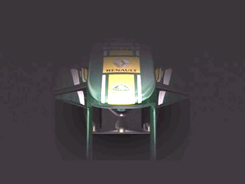
The full R31? http://www.sliwinski.priv.pl/f1/3zhg_r31.jpg
First Time Starting up the engine http://a.yfrog.com/img615/9379/3zhg.jpg
25th January 2011, 1:18 at 1:18 am #158445 Prisoner MonkeysParticipant
The full R31?
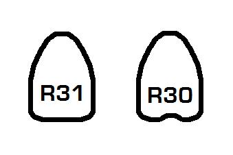
It’s just an R30 in R31 make-up.
25th January 2011, 1:19 at 1:19 am #158446ParticipantPossible Rb7 Front wing and Nose under cover? http://www.redbullracing.com/cs/Satellite/en_INT/Article/RB7-Launch-Date-Announced-021242949958471?refmod=ContentFeed&refmodpos=A1 Unlikely as it looks off but still…
25th January 2011, 1:56 at 1:56 am #158447ParticipantNo its not, look at the r31’s nose, its very rb6 esque and its pretty low. No its not the same.
25th January 2011, 4:59 at 4:59 am #158448Adam Tate
ParticipantI remember Williams experimenting with 3 inlets for the airbox in recent seasons. Though this Renault seems far more pronounced than those of Williams.
25th January 2011, 6:11 at 6:11 am #158449Prisoner MonkeysParticipantNo its not, look at the r31’s nose, its very rb6 esque and its pretty low. No its not the same.
Everything else is – the car still has an F-duct on top of it, and F-ducts and shark fins that reach the rear wing are banned for this season.
30th January 2011, 20:01 at 8:01 pm #158450Participant30th January 2011, 20:02 at 8:02 pm #158451ParticipantIts confirmed that it is real on their website so yes its official :)
http://www.mercedes-gp.com/en/#/s/gallery/54/MGP+W02+Digital+3D+rendering
30th January 2011, 20:20 at 8:20 pm #158452Guilherme
MemberHey, I liked it! Even though the nose is very RB6-esque and the front wing is the same as last year, I liked it! The sidepods looks nice and the livery is a hundred times better now, in my opinion (I hated that black thing on the nose of the W01).
30th January 2011, 20:21 at 8:21 pm #158453 Force MaikelParticipant
I got to agree with you polishbay that the pictures of the R31 are indeed reel if you take a closer look you can see that the livery and front wing are completly difrent
renault oploaded a teaser trailer of the R31 on their site
30th January 2011, 20:23 at 8:23 pm #158454Pedal to the Vettel
Member@polishboy, yer I saw the picture of that just a few hours before on a facebook link and wasn’t to sure if it was a fake or just an artist’s perspective etc..
Can’t wait to see it…
30th January 2011, 21:17 at 9:17 pm #158455TomD11
ParticipantI posted this in the round-up but I thought I’d post it here too, what chassis do people think this is?
http://www.thef1times.com/community/display/00194
It doesn’t appear to be the 2010 Lotus, so is it a generic F1 car, the more unlikely option of 2011 car, or summat else?
30th January 2011, 21:30 at 9:30 pm #158456ParticipantIts a half lotus thing. This was based on last years lotus, but you can see some small changes. This years lotus is much sleeker, here are some photos of it.
30th January 2011, 21:31 at 9:31 pm #158457ParticipantIf you think its an r31, refer to this pic for re assurance.
30th January 2011, 21:42 at 9:42 pm #158458Snaiperskaya
ParticipantJust thought i’d say i think the Mercedes looks really ugly, and i prefered the old colour scheme. :(
- AuthorPosts
- You must be logged in to reply to this topic.